Sunday, December 28, 2008

Walking on trashbin

My protecting environment poster expresses the idea about a future when we just can walk on garbage cans, which are replacing our ways/roads already for "some reasons".

I try to make a walking figure and join it to the font but it looks really weird+______+ I will try another version when I have more time :D

Source:

http://www.sxc.hu/photo/1003130

Friday, December 26, 2008

Face the core


Another poster for environment^^

The unique image is a strawberry. The outlook of this strawberry is not only delicious but also attractive. However, the core of it is just "trash" or "garbage". In addition, the garbage core seems to continue to expand to the whole strawberry.

Some people just see the advantages of development and can not see its consequence.My message is that: "There are more and more garbage in our world, also, they affect your life already. Let's face and deal with it".

Texts' order, colors and their background are arranged in purpose.

When people read from top to bottom, all the texts relate to each others and make sense. However, even if people separate the middle texts and read just the rest, they still have their own meaning.


The middle text has different background from others as a highlight effect. Also, the most important word, "core" has a red color for being noticed.

Source:

http://www.sxc.hu/photo/1036400

http://www.flickr.com/photos/23335593@N05/2989651622/sizes/l/

Supplementary entry

I try to update/fix my right images in the previous entry, however, it appears this sentence.

[Tag is not allowed: meta equiv="Content-Type" content="text/html; charset=utf-8"]

No matter what I change, the sentence still shows up. Then, I have to create this new one.

This entry is a supplementary entry for the entry "Death by Appointment"

My problem is that I forgot to change images to RGB mode.

Here are my right images.

Sunday, December 21, 2008

Death by Appointment


These images are my design for Death by Appointment book covers.


My idea is using a timetable page to lead viewers pay attention to the title.


My 1st draft contains the "unaccomplished" word for the meaning of cannot finish the work in the timetable because of some " mysteries" and people will try to figure them out.


My finish cover has a red letter in the middle of the page for getting attention. People can see this letter as the "appointment". the note in the page is grey and covered by blood, which has same meaning as "unaccomplished".


The bookmark is created which has a pen and some documents at the top for the connection to the timetable note.


And even though I try so hard to upload the right color images, there's some problems with them.+_______+. Every time, all images just turn the color into a disaster no matter what resolution I change .


I will try to fix it as soon as possible.

Sunday, December 14, 2008

Forest fire


Here is my forest protecting poster XD. My idea suddenly came out when I looked at leaves in my garden. By comparing two opposite images in a humorous ways, I believe the poster will be paid attention and stay in people's mind more then other images.

Also, I give a statistic a bout forest fire for people to know the purpose of this poster.

All images are taken by me :D

Friday, December 12, 2008

Violence in family poster


In my poster, the unique image is a broken puppet which covered by many cracks.

The doll, representing for wife, not only is soulless but also carries on many "wounds". In fact, when a husband uses violence on his wife, he does not have his half to share feeling anymore, just a doll that takes all his meaningless actions.

Also, soullessness and cracks on her body showing a sorrow feeling not only on body but also on feeling.

Background is black, contrasts texts in an effective way. Distorted and broken typeface is applied for being suitable to the whole poster's meaning and style.

In addition, these text have different sizes and arranged in order to emphasize each important meaning.

I think I work well in this poster^^ Hope to receive your comments :D.

Source:

http://www.flickr.com/photos/nic/297302838/sizes/l/

http://www.sxc.hu/photo/995829

Sunday, December 7, 2008

My flash :")


This is the flash I made for motion typography.

Firstly, "All right" appears with the red exclamation point for showing a strong emphasize. After that, "who" which pushes the "All right" away in order to presenting the speed of the saying.


"DID" and "IT" are punned. Also, its meaning is "it" comes inside from "DID".


The next sentence is arranged for pointing out the "not" word. Then, the following saying is arranged like coming upstairs, a way to expressing the voice and speaker's feeling.


Finally, I upturn "PUNISH" to make it hit "them"- as the definition of "punish", and finish the sentence.


Lowercase and uppercase in this flash are considered based on their importances.

Saturday, December 6, 2008

Hesitation


Here is my assignment 2.

There are ten pictures used in my work. The main subject is hesitation.

A dry land with many cracks is chosen to be the background for the collage. It represents a broken tired, like “dried” feeling.

The main character is the face of a man- a husband, at the top- left side. Everything in the whole picture is his “hesitated” thinking. Also, just half of his face is shown and others sink in his dark feeling.

A part of a woman’s back picture is on a frame which is put at the corner. The glass frame is cracked while the woman has no color. These mean that in the husband’s heart, his wife’s existence is not precious anymore. Crack glass covering the wife picture for a deep thought wounds.

In the right hand side of the image, there is a dead-dried tree expressing the situation of the main character’s family. In addition, a crying girl is on a branch of the tree. In fact, the most colorful figure in the whole picture is this girl-who is the daughter of the man. It is understood that the girl is the only thing making his life livelier and also the only one thing stop him going away.

The man understands his daughter’s feeling, that’s why inside his mind, she is crying lonely, leads him to a hesitated situation.

The girl represents for the only leaf of the tree.

In the middle of the picture, wedding rings with just black and white combined with a waking-away figure in order to describe a leaving thought. Marriage now is just a burden.

Even though this thought is really strong- explains why it is arranged in the middle, the most colorful part is still his daughter. All results a wrestle in his mind.

Basing on these factors, the college is created.

Sunday, November 30, 2008

All lonely.


This time, I change my mind. Light, darkness and dark background are combined like my previous idea. However, the light just can shine small corners. Also, the only organic one is the bird of paradise flower which is "looking above" and "seeing" a very unsteady light.

Inside and outside walls just emphasize the cold sense.

I think I apply the unity principle not bad ^^.

An outstanding artificiality


Tonight I become an amateur photographer:")

This scene is taken in my house's corridor.

In this picture, I want to express an idea about nature and artificiality.

Everything in this picture is just made by human except plants. Two lights above can be considered as artificial suns of two cactus pots.

Also, I want to show how nature is surrounded by human and artificiality. That's why I take the picture from the ground( from the bottom) to represent that the wall is great, the light from the lamp is so shining while plants are small and blur.

In addition, I want a balance to smooth the view and make the picture look like "yeah, a normal picture", unless viewers start to think about the cactus' status in the picture.

The contrast and colors in this picture are also deeper : lights and darkness for the outstanding and its opposite.

I hope you guy like it^^

I took many pictures and choose the best. Some of I my trials are below here :

Friday, November 21, 2008

Drawing and coloring

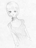
Last night, I had a sudden inspiration and drew a picture.

This picture is my painting after scanning.


Then, I wanted to color the girl for more interesting, so I used Threshold in PS and Live Trace in Illustrator to fix and made her more clearly.


After that, I converted my picture into png file and put it in the PS for coloring.

I would like to use just black, white, red and brown for her. I tried for almost night for choosing right color. In my opinion, I thought just color her hair, necklace and her lips were enough.Here are my versions for my girl.


Sunday, November 16, 2008

Calendar

This is the calendar for the new year January 2009.

The idea is for new spring, therefore, i make the background look green and refresh.

The donkey is the main idea which makes the whole layout more lively. It is a figure which I bought and place it in my house. The whole donkey climbing the pillar looks hilarious XD.

The donkey was 1stly put in a funny gesture. Then it was combined with the top of my desk lamp to make the whole picture.

After erasing the background, I decide to create a very simple wallpaper, just the donkey, numbers and "green".


Halloween wallpaper


31/10 is Halloween day, which is the time when children wear monster or ghost costume and go around houses in their home town to ask for candy^^ This is also the day when ghost and witch flying everywhere and scare people.

Basing on this idea, I create a theme consisting moon, witch, gift and night. These factors are combined together for making a not only cute but also pretty wallpaper.

The background is made by using PS and the rest are by Illustrator.

In the middle of the moon is my little cute witch who is in extra happy mood for his archive in 31/10^^

The whole wallpaper just have two colors: black and white for making an impressive and a contrast among night, moon and pine trees.

Sunday, November 2, 2008

My layout


This layout is made based on the Closure and Proximity concepts of Gestalt.

In my layout, "white" is the color for emphasizing and helping people to pay attention to
important parts.

White lines run around the content and emphasize the "Plants" title in its own way. Also, these lines remind readers the rectangular shape and make them focus not only on the picture but also on the content.

Pictures are arranged over each other- overlap- for making more interesting and impressive.

The quote is "inside and on" another picture of flower for helping people know the key sentence of the article.

Background is one of flowers pictures which is picked carefully for the suitable color and meaning.

^^Hope you guys like this^^


Ket logo


This is the logo I made for my design team.

My 1st idea is that I would create a logo that make people look at it and remember it with a "unique feeling".

"Ke" is my nickname and "T" is my friend's nickname. We work together and I want to have 2 nicknames in our logo. Besides, my second idea is about cat. "KeT" is pronounced similarly like cat, which is suitable to both of my thinking.

I draw the letter "T" as a tree, with its shape like the tree is protecting "ke" and laughing happily. We can see as the two of them are dancing.

Also, the letter "e" is adding an eye and a "crown" on its head( like a queen^^).

Eyes are my favourite and main important parts. They affect people strongly.

Honestly, I feel satisfied of my logo^^ I made a plenty of them and this is the latest archive.

If you think changing something in it will make the logo look better, feel free to tell me^^

Sunday, October 26, 2008

Tam Sanh panel


In my previous break-time, one of my acquaintances asked me to do a panel for his company.

My friend, Truong, and I did together to finish this work.

This panel's size is 2x3m, consequently, the size and resolution were a small trouble for our computers. Besides, our customer gave us just 3 hours to create it. So, at that time, we almost got mad, especially when our heads had no idea.

Our customer required the information of his company and send us 3 original pictures ( I upload in the source part for you guys :D). In addition, after asking us to think a slogan, he said that we had to use his company's slogan that the director had just been thought.T_T.

The content was about lathe machine. Then, after a long time finding images to suit to our ideas, we agreed to use two gears combine with all the machines' pictures. The top-right and the middle pictures in the panel were most important parts of the lathe machine. We created layer masks to make all pictures look natural. In addition, we worked so hard to clean all images and cut it.

One more information is that at the right-bottom, we added our logo's team.
I know that this panel still has some mistakes. However, "It's not as good as I want, but with that amount of time, it's ok", I though so.

I also upload all addresses where I picked images( I did check the creative common+ non-commercial boxes when I searched~~:P)

Have a look and give me a comment ^^. Thanks.

Source:

http://www.flickr.com/photos/vieira/190362174/sizes/o/

190362174_ad783d28d8_o

http://www.sxc.hu/photo/957144


My Sun and Moon


My style is cute style. Frankly, I'm affected so much by chibi style of Japan.

I love to make thing that can make the readers laugh and feel relax. So I often choose humorous ideas to do rather than others^^

So here are my 2 versions "Sun and Moon"

This is my 1st version. The background is bright pink andthe sun lights are red for expressing that this scene happens during day. The content is very clear when you see my sun and moon' feelings.


And this is my 2nd version. The background is changed into little-dark blue. Moon is winning in night :D. I turn the color of the sun into light-orange for making a decrease of sunlights' strength. Also, eyes and feeling expression of my 2 objects are added for more interesting.

~~ Besides, thank you to Kohaku^^ She showed me a friend's picture about funny expression^^ My sun's is made based on it :P

~~ XD happy time ^^ yay^^ Feel free to give me comment^O^