Sunday, November 30, 2008
All lonely.
This time, I change my mind. Light, darkness and dark background are combined like my previous idea. However, the light just can shine small corners. Also, the only organic one is the bird of paradise flower which is "looking above" and "seeing" a very unsteady light.
Inside and outside walls just emphasize the cold sense.
I think I apply the unity principle not bad ^^.
An outstanding artificiality
Tonight I become an amateur photographer:")
This scene is taken in my house's corridor.
In this picture, I want to express an idea about nature and artificiality.
Everything in this picture is just made by human except plants. Two lights above can be considered as artificial suns of two cactus pots.
Also, I want to show how nature is surrounded by human and artificiality. That's why I take the picture from the ground( from the bottom) to represent that the wall is great, the light from the lamp is so shining while plants are small and blur.
In addition, I want a balance to smooth the view and make the picture look like "yeah, a normal picture", unless viewers start to think about the cactus' status in the picture.
The contrast and colors in this picture are also deeper : lights and darkness for the outstanding and its opposite.
I hope you guy like it^^
I took many pictures and choose the best. Some of I my trials are below here :
Friday, November 21, 2008
Drawing and coloring
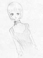
Last night, I had a sudden inspiration and drew a picture.
This picture is my painting after scanning.
Then, I wanted to color the girl for more interesting, so I used Threshold in PS and Live Trace in Illustrator to fix and made her more clearly.
After that, I converted my picture into png file and put it in the PS for coloring.
I would like to use just black, white, red and brown for her. I tried for almost night for choosing right color. In my opinion, I thought just color her hair, necklace and her lips were enough.Here are my versions for my girl.
Sunday, November 16, 2008
Calendar
This is the calendar for the new year January 2009.
The idea is for new spring, therefore, i make the background look green and refresh.
The donkey is the main idea which makes the whole layout more lively. It is a figure which I bought and place it in my house. The whole donkey climbing the pillar looks hilarious XD.
The donkey was 1stly put in a funny gesture. Then it was combined with the top of my desk lamp to make the whole picture.
After erasing the background, I decide to create a very simple wallpaper, just the donkey, numbers and "green".
Halloween wallpaper
31/10 is Halloween day, which is the time when children wear monster or ghost costume and go around houses in their home town to ask for candy^^ This is also the day when ghost and witch flying everywhere and scare people.
Basing on this idea, I create a theme consisting moon, witch, gift and night. These factors are combined together for making a not only cute but also pretty wallpaper.
The background is made by using PS and the rest are by Illustrator.
In the middle of the moon is my little cute witch who is in extra happy mood for his archive in 31/10^^
The whole wallpaper just have two colors: black and white for making an impressive and a contrast among night, moon and pine trees.
Sunday, November 2, 2008
My layout
This layout is made based on the Closure and Proximity concepts of Gestalt.
In my layout, "white" is the color for emphasizing and helping people to pay attention to important parts.
White lines run around the content and emphasize the "Plants" title in its own way. Also, these lines remind readers the rectangular shape and make them focus not only on the picture but also on the content.
Pictures are arranged over each other- overlap- for making more interesting and impressive.
The quote is "inside and on" another picture of flower for helping people know the key sentence of the article.
Background is one of flowers pictures which is picked carefully for the suitable color and meaning.
^^Hope you guys like this^^
Ket logo
This is the logo I made for my design team.
My 1st idea is that I would create a logo that make people look at it and remember it with a "unique feeling".
"Ke" is my nickname and "T" is my friend's nickname. We work together and I want to have 2 nicknames in our logo. Besides, my second idea is about cat. "KeT" is pronounced similarly like cat, which is suitable to both of my thinking.
I draw the letter "T" as a tree, with its shape like the tree is protecting "ke" and laughing happily. We can see as the two of them are dancing.
Also, the letter "e" is adding an eye and a "crown" on its head( like a queen^^).
Eyes are my favourite and main important parts. They affect people strongly.
Honestly, I feel satisfied of my logo^^ I made a plenty of them and this is the latest archive.
If you think changing something in it will make the logo look better, feel free to tell me^^
Subscribe to:
Posts (Atom)